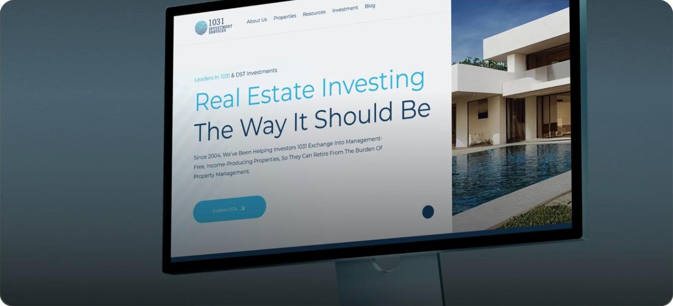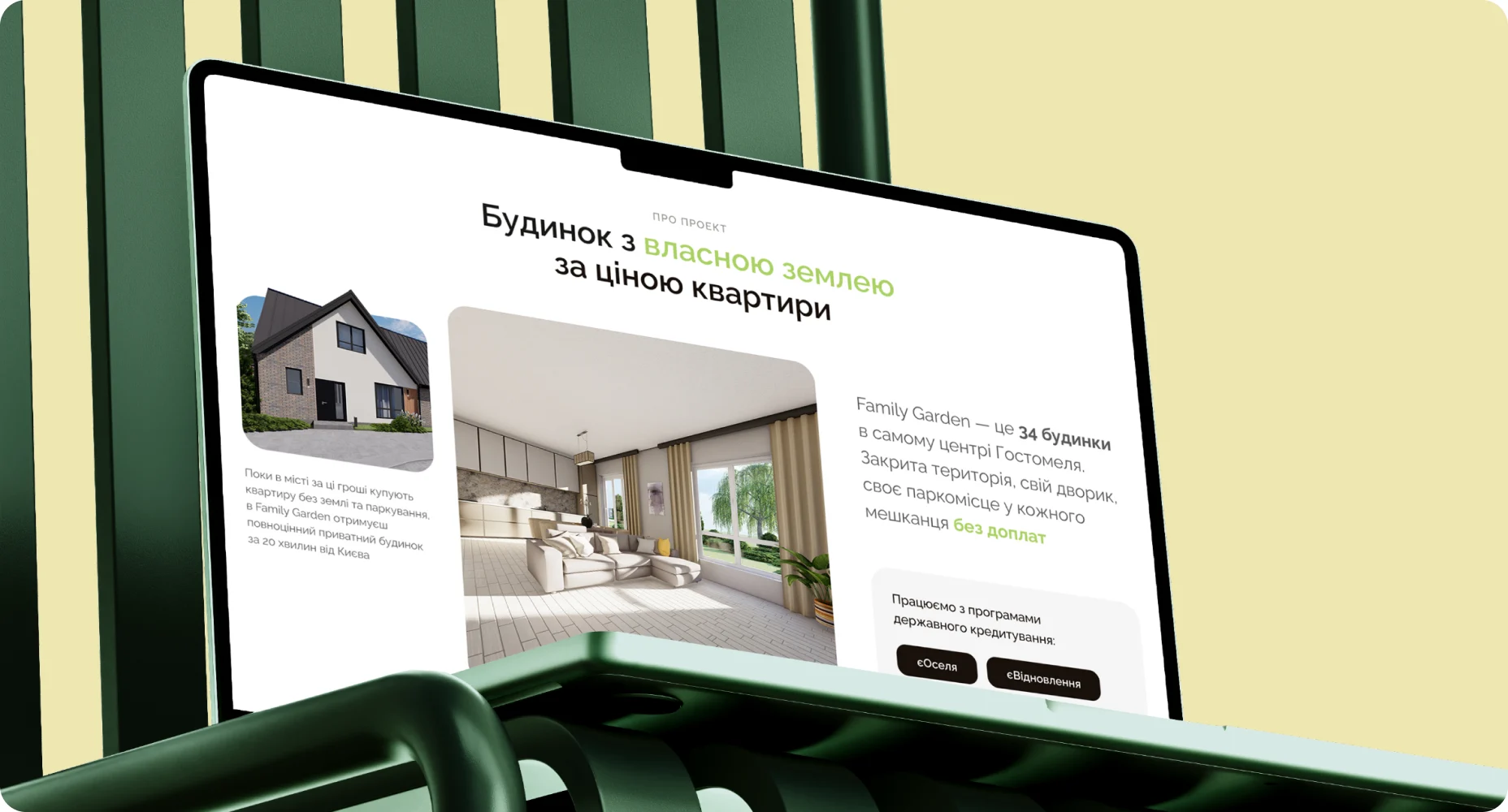
The story5 decisions · original frames
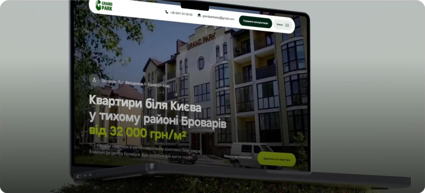
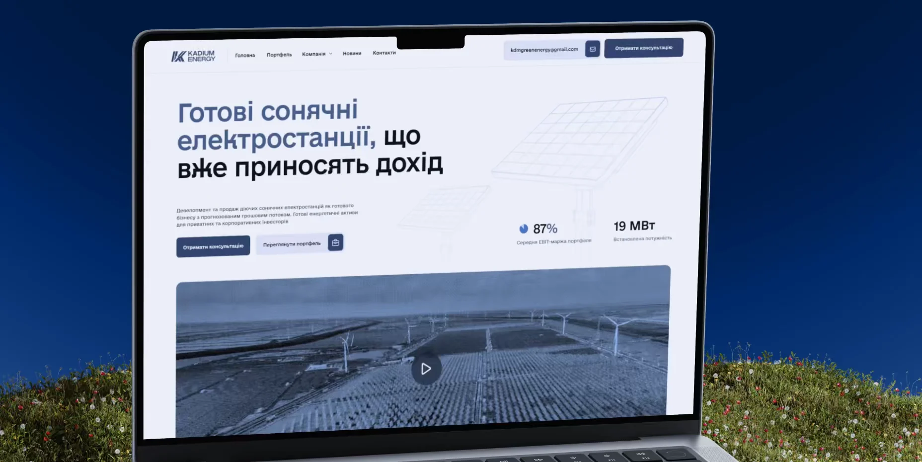
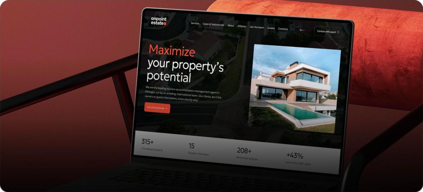
Frames from the original case · interface in Ukrainian01Plan
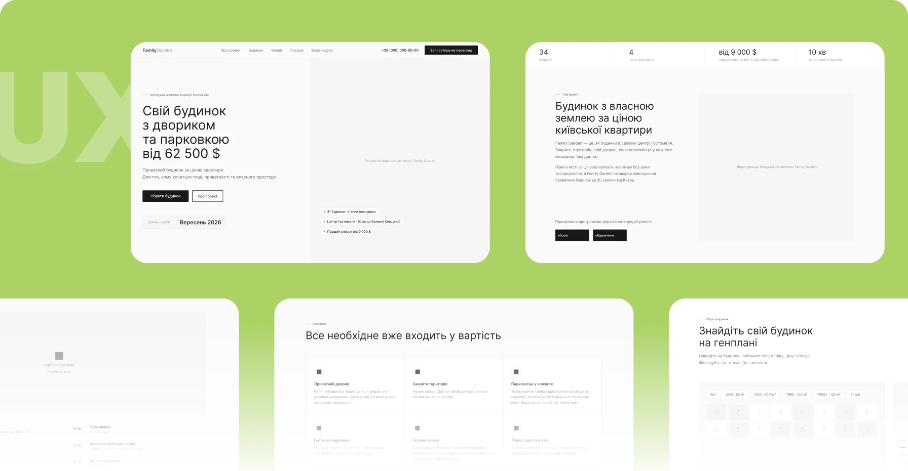
Journeys first. Screens second.
Before designing, the team defined the key user journeys, the navigation between sections and the information priorities, and tested them in prototypes before development began.
02Show
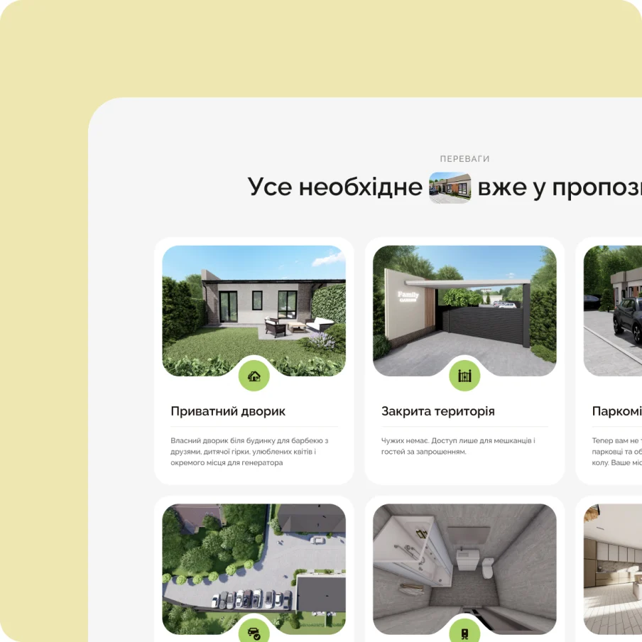
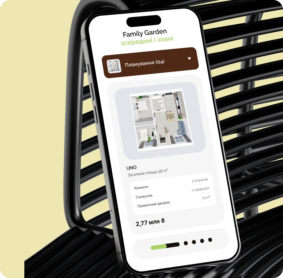
The homes, and the life around them.
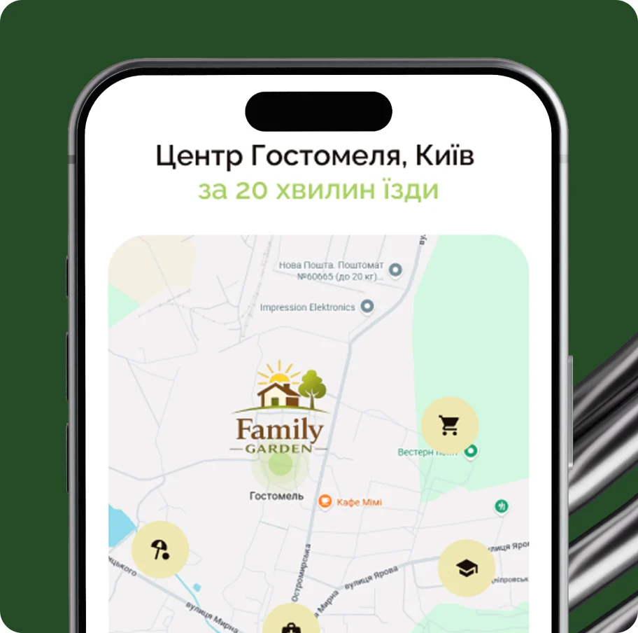
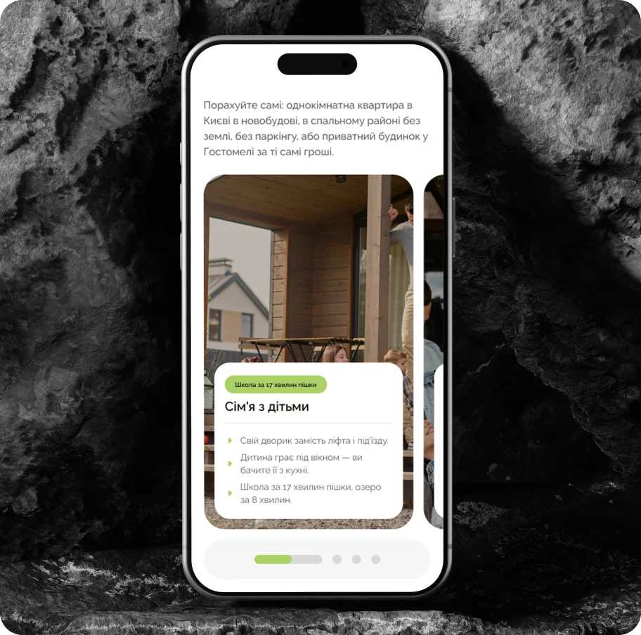
The site shows both the Family Garden houses and the future way of life in Hostomel: a private home 20 minutes from Kyiv.
03Design
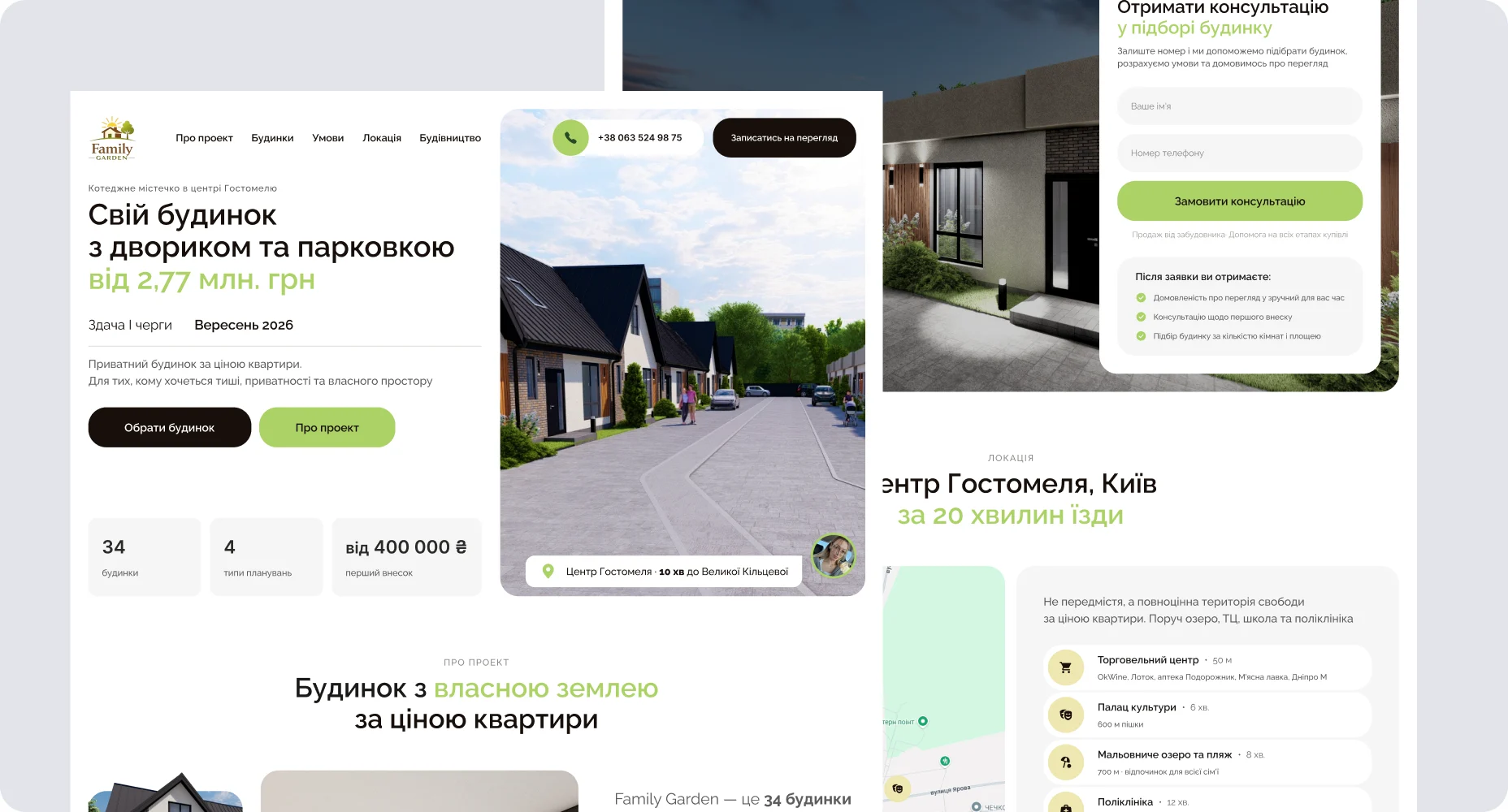
From the idea to the finished interface.
Interface design grew out of the user experience: the journeys set in the wireframes became the layout of every screen.
04Decide
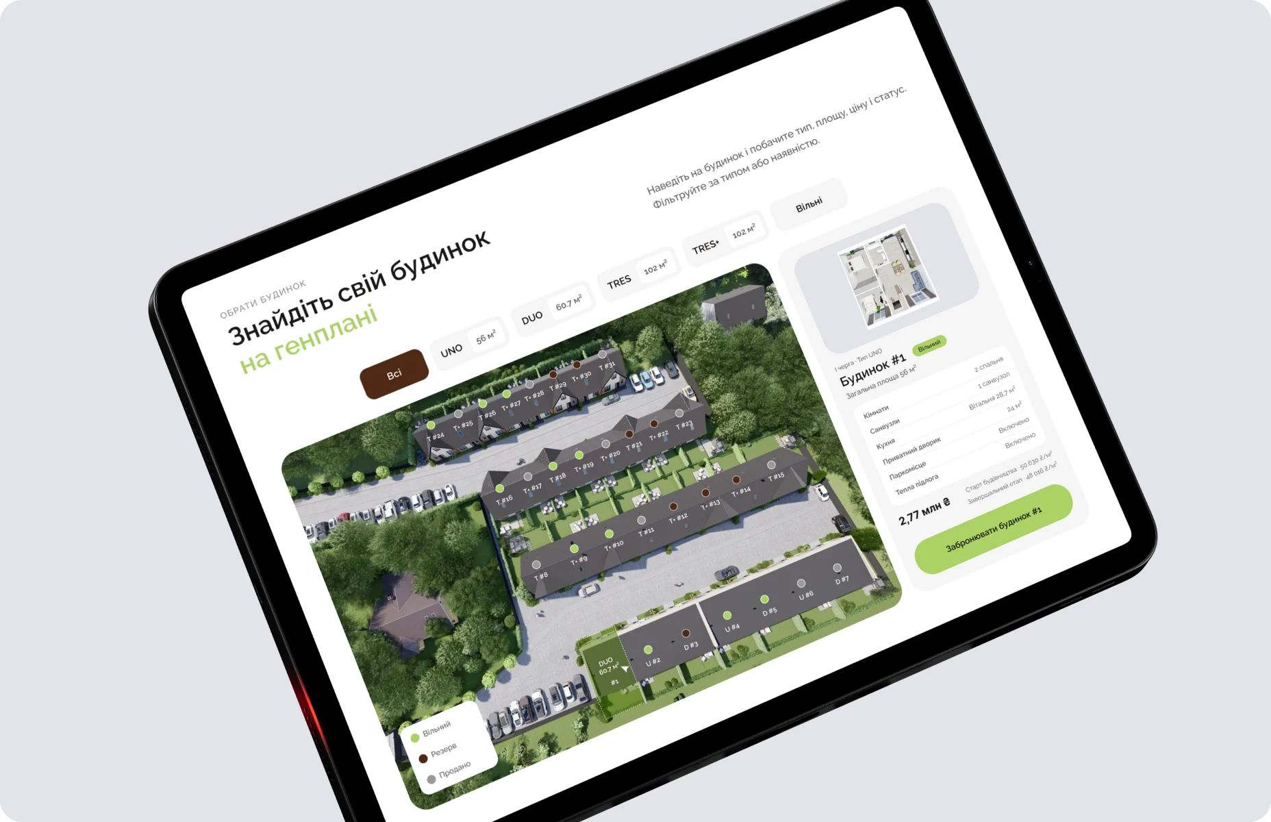
“Sold” is shown, not hidden.
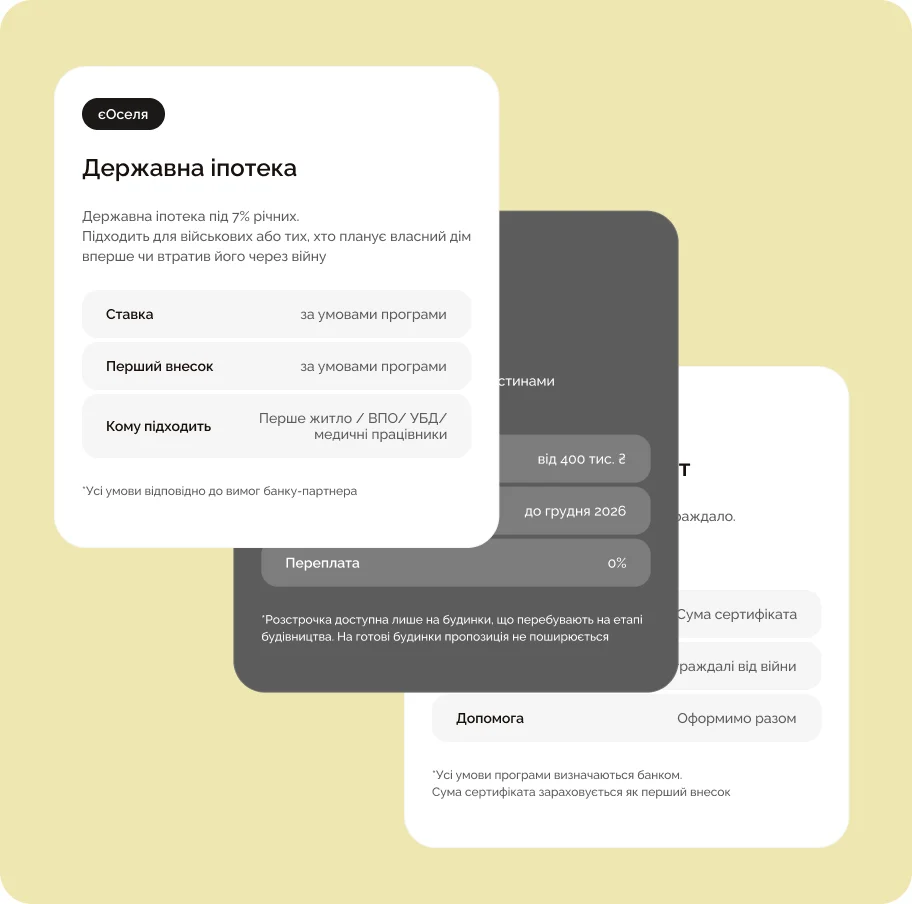
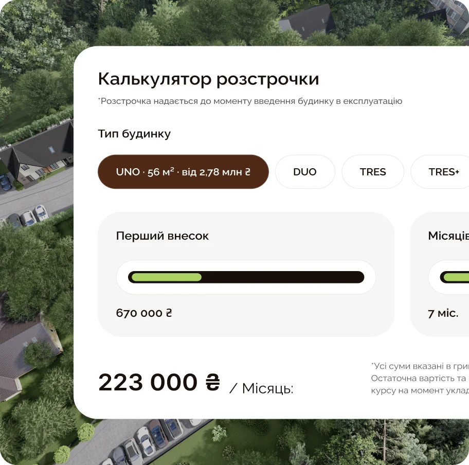
Occupied houses help buyers decide, so the status stays visible. Mortgage options and an instalment calculator answer the money question on the same page.
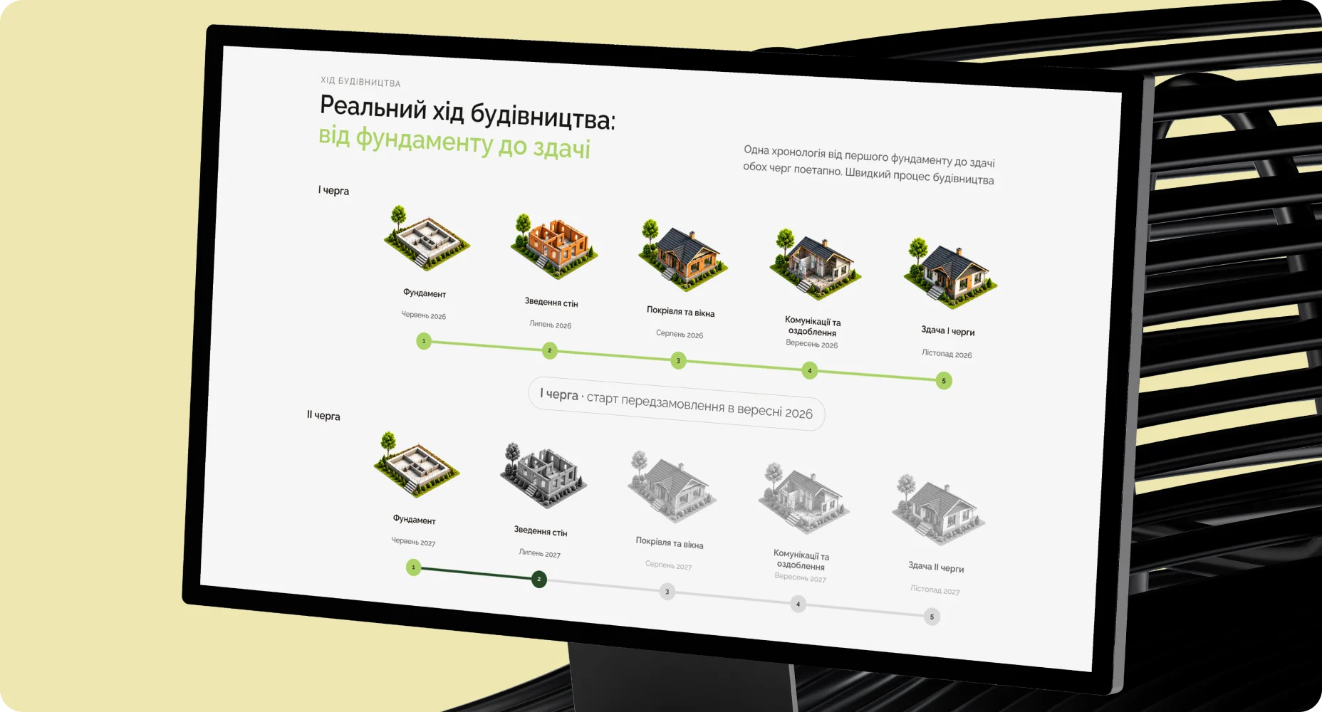
05Phase
Phase one in colour. Phase two in grey.
What is built is highlighted, what comes next is grey. The difference needs no explanation.